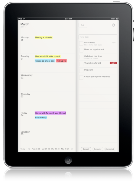

Planner for iPad puts your weekly agenda and todo list on the same page. A calendar on the left, a list of tasks on the right.
This format is very popular in many bound paper planners. It’s a comfortable way to stay organized. The tasks stay put no matter what week it is, and you can cycle between your current, someday, and completed tasks. My wife used to move a post-it note with tasks on it from week to week; she inspired the layout.
Planner integrates with the built-in Calendar app to provide event alerts on the default calendar. Manage your life from the app; since the events show up on the regular calendar you can see your events and reminders on your phone or desktop. Note that it’s one-way. The app doesn’t import your system calendar events at this time.
You only need to type a word or two to create an event or a task. Tap, type, done. No need to do anything else if you don’t want to.
Planner believes in making it easy for you to plan your week and get more done. It doesn’t have dozens of task categories, tags, a half dozen status lists, and mandatory workflows. The idea is to improve a little on the classic paper planners that thousands use every year.
Try the app and get your review posted here on the site! I’d love to link to any reviews you post also.
iPad running iOS 4.2 or later.
Please let me know if you need anything. Contact me about it.